Find the Perfect White Paint
Words by Hannah Nixon
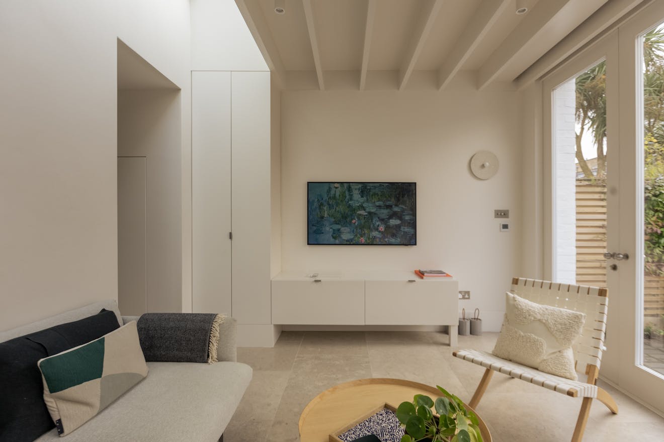
Once considered the simplest choice for a colour scheme, the modern world of paint has rendered choosing white surprisingly complex and even overwhelming, with a sea of finishes and swatches to navigate in pursuit of that ‘perfect’ shade. At its best, the colour white acts as a visual palette cleanser, allowing art, objects and furniture to take centre stage. Yet, choose the wrong undertone and the result can feel stark and uninviting.
To help us chart a course through it all, we put a series of questions to our panel of knowledgeable experts, from esteemed paint brands to interiors influencers with vast followings. We asked why so many favour Little Greene’s Slaked Lime; whether a room’s orientation truly makes a difference; and if primer is really necessary. We hope their insights prove useful the next time redecoration is on the cards.
“Whites are so nuanced so buying sample pots is key”, advises Despina Curtis of Ette, a creative agency for colour. She goes on to say, “Paint an entire A4 (or better still A3) piece of paper right to the edges so there is no white border around it to distract you. Ideally you want to either move your testing papers around the room every few days to see how the light affects the colour.”
For Emily Den – whose Instagram account @doingupden documented the renovation of her Edinburgh home – pairing back on the pot sampling pots felt like the way forward, “I didn’t trial endless whites during the renovation. I think that can quickly become overwhelming and to be honest, incredibly unnecessary. Instead, I focused on a small edit of softer, deeper whites. In general, the further away from brilliant white, the better. It feels more intentional and brings character to a space.”
The question of mood is at the forefront of Sam Palmer’s mind, whose interiors instagram account @the_flint_house documenting her West Sussex home has a dedicated following, notes, “The first consideration is how you want the room to feel; cosy, calming or bright and contemporary? It helps to be really clear on the feeling you want to have in the room first.“
Cassandra Ellis, of bio-based paint brand Atelier Ellis concurs, “I think of white paint as a state of mind. We often want to paint something white as a way of cleansing or simplifying our homes and lives, so we can ignore that white is an actual colour – but white is most definitely a colour as well as a feeling. You just have to find the right one for the feeling you want and the home you have.”

Francesca Wezel, who runs eco-friendly paint company Francesca Paints, is firmer on tone, “The most important consideration is that the white should not be brilliant white; under the English light, it can look cold and grey. It is best to add some warm pigments, such as yellow ochre or raw and burnt umber, to create more depth and a richer colour.”
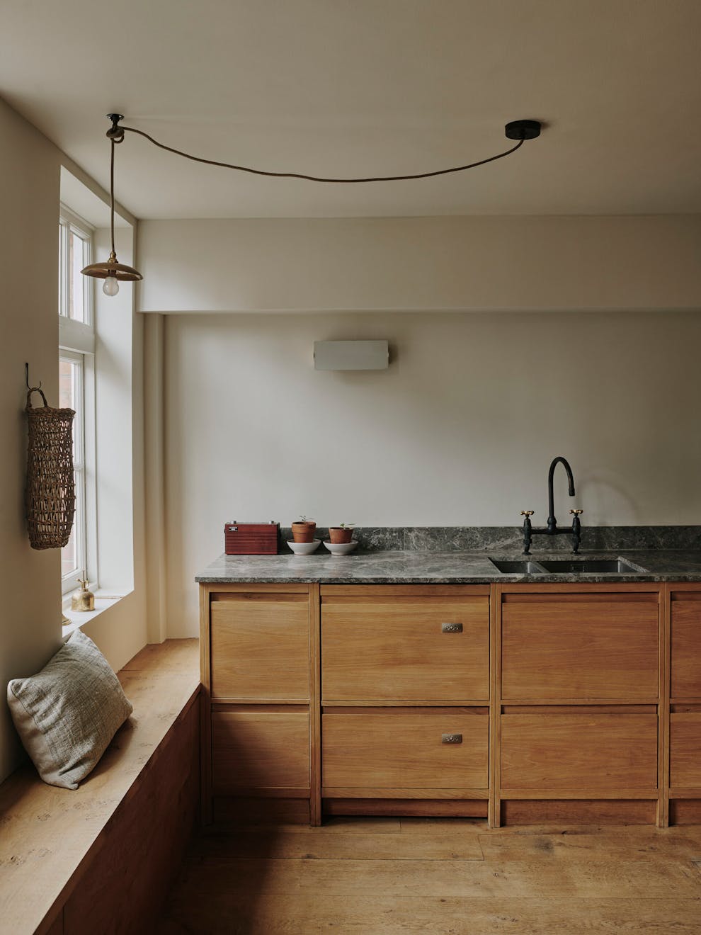
Light and its effects on undertones are also important considerations. Dominic Mylands, CEO of Mylands Paints, thinks it comes first. “You should consider the room in terms of light, proportions, and the atmosphere you want to create. A stark, brilliant white can often feel harsh or overly bright, especially in domestic settings. I tend to encourage people to opt for softer off-whites or warm neutrals like Cadogan Stone No.59, which have more depth and subtlety.”
The orientation of your rooms has an impact on their relationship with light throughout the day. North-facing rooms, however, needn’t equal gloomy, as Despina Curtis from Ette reminds us, “One thing to note about north-facing rooms is that less natural light causes fewer shadows so this can lead to a beautiful tranquil space. They receive the least amount of natural light so choosing whites with a warm undertone (yellow or pink, for instance) helps to add warmth.
This question divided the panel, but, interestingly it was our paint brand experts who had the strongest opinions and who favoured ditching a primer altogether. “We don’t believe in wall primers,” says Cassandra Ellis, whose paints even bypass the need for a mist coat, “Our True Matt Emulsion can be painted directly on fresh plaster (lime or gypsum) or previously painted walls. White is never white, so if you can manage without it – we strongly suggest you do.”
This was echoed by Francesca Wezel of Francesca Paints, “With our eco emulsion, we discourage the use of primers, as our paints are breathable and can be applied directly to breathable surfaces without a primer or mist coat.”
However, one thing to question before you forgo primer for good is if you are painting onto a very dark hue. “It can be useful if you are painting over a very deep or bright colour as it creates a barrier between the original colour and your new colour,” says Despina Curtis.

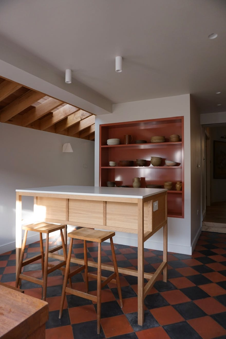
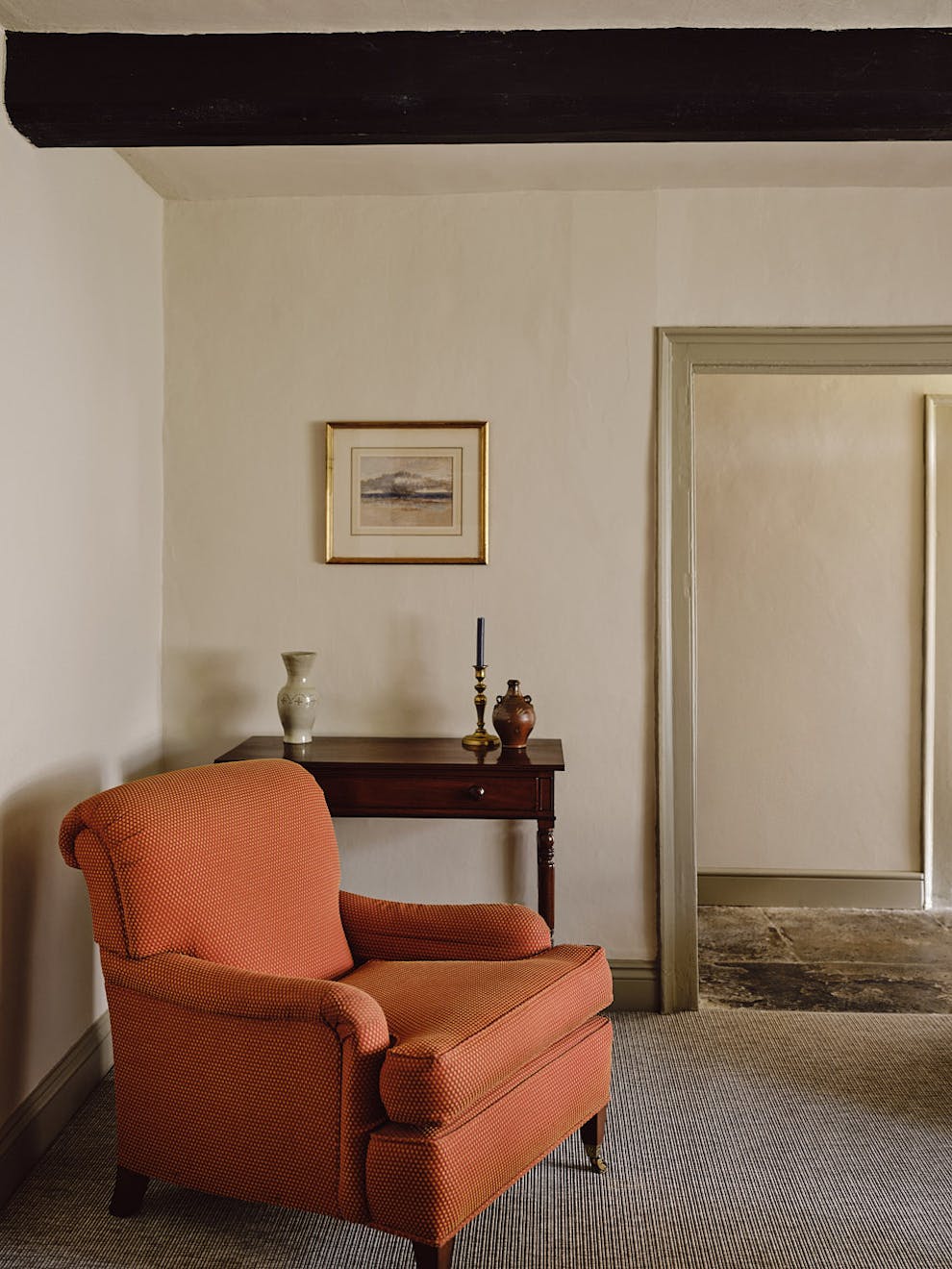
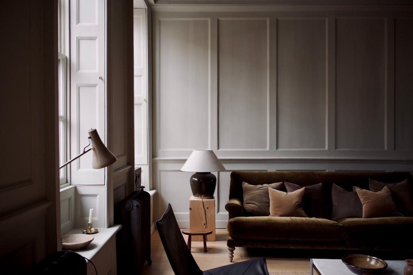
“Selecting a ‘white’ paint is really challenging!”, says co-director of DGN Studios, Geraldine Ng. “We find it much more time-consuming to get right than with other colours.” Their recent project Stone and Steel House used Little Greene’s Slaked Lime to striking effect. “We find it much more time-consuming to get right than with other colours.” There are, however, some favourites. “For cool whites, we often used Farrow & Ball Blackened. At the warmer end of the spectrum, Farrow & Ball Wimbourne gave an elegant atmosphere to a listed Georgian townhouse we recently worked on.”
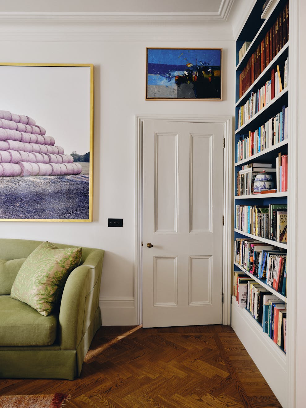
Georgian homes and listed properties absorb paint differently, and as Paul West – who runs the Instagram account Considered Things – noted, sometimes it feels more appropriate to honour the heritage of the property with a hue from the era. “We chose Farrow & Ball’s Old White, a dark, stony white that, when placed next to a true white, barely reads as white at all. When moving to Stepney Townhouse, which dates back to 1717, the time felt right to revisit this historic white. The rooms are largely panelled, and here this drab white lands perfectly. It gives the spaces a distinctly historic atmosphere without feeling oppressive.”
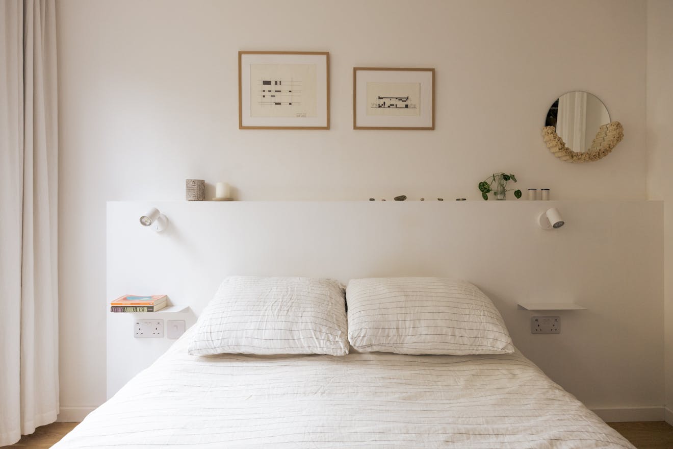
Sara Mungeam, a micro-developer who recently finished two contemporary new-build apartments in South London also opted for Slaked Lime but in the mid tone, “I’ve used Slaked Lime Mid many times – including as the main backdrop white throughout my own home. It’s got a lovely warm milky quality to it and I find it tends to work well in any aspect.” She goes on to say, “I tend to avoid anything too stark and bright or brilliant white, preferring something with a bit of softness to it.”
We asked the founders of the paint brands we gathered together about their most popular white paints. Francesca Paints, which specialises in limewash and eco-emulsion hues (as well as giving its white tones tasty names including Halloumi and Popcorn) recalled, “We have many off-whites available. The most popular are Galao 1 from the Fresh Collection, Milk Buti from the Mughal Spring Collection and Peace White from the Off White Collection. I think the reason these are liked so much is that they are warm and peaceful without being too yellow, creating a cosy and calm atmosphere.”
For Dominic Myland, it was a collaboration that created the most popular white, “Beata White BH.01, born from our collaboration with Beata Heuman, is one of our best-selling whites of the last year. It has a slightly grey yet warm undertone, which makes it incredibly versatile. It doesn’t feel cold or clinical, but equally it isn’t too creamy or dated. That balance means it works across a wide range of interiors, from contemporary spaces to historic properties, and in varying light conditions.”
At Atelier Ellis, Cassandra Ellis noted that the best-selling white also hits close to home. “I have used our best selling Khadi in a recent home. It’s perfectly balanced and warm but also sophisticated – which is probably why it is our best-selling white. It sits within our Warm White family – which is exactly how they feel.”
The positive, neutralised environment was one of the main points that our panel returned to. “White works because it is both easy and complex. It navigates changes in life and collections we gather, differing opinions and the option to delay decisions,” noted Cassandra Ellis. Dominic Myland echoed a recurring theme: the sense of peace or serenity white can evoke, “It creates a sense of calm and space, while acting as a fresh backdrop for your home. White walls don’t necessarily mean a lack of colour, as they allow you to introduce richness and personality through fabrics, artwork and furniture. That flexibility is what makes white so timeless.” he says.
Thank you to everyone who generously gave their time and opinions for this piece:
Despina Curtis | Ette Colour
Emily Den | Your Den
Sam Palmer | The Flint House
Cassandra Ellis | Atelier Ellis
Francesca Wezel | Francesca Paints
Dominic Myland | Mylands
Geraldine Ng | DGN Studio
Paul West | Considered Things
Sara Mungeam | House Obsessed

