Gothic Revival: Inside Architect Neil Dusheiko’s Church House Project
Words by Hannah Nixon
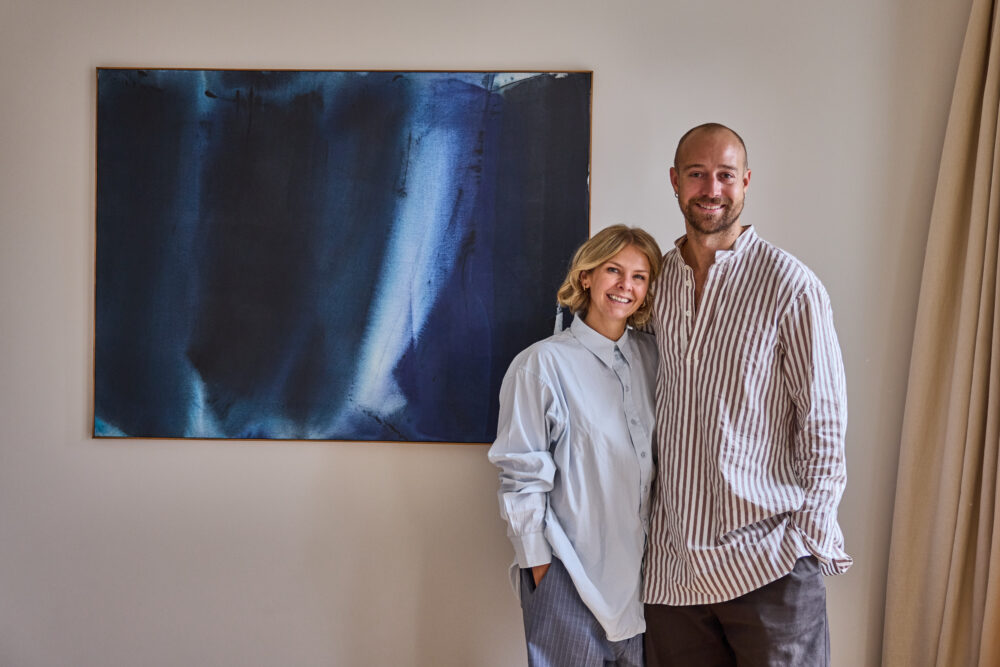
“Like a lot of people, I moved to London and thought, ‘I’m never coming back to Cambridge,’” Susie Manning says, smiling. In the background, the spire of the Grade II* listed Church of All Saints looks so picture-perfect it almost resembles a screensaver, were it not for the gentle breeze of the towering Cypress tree next to it. Sitting in the new extension of her Neil Dusheiko-designed home in South Cambridgeshire, Susie recalls how a desire to put down roots brought her back to the county where she grew up. Having set up her own fashion brand in London, she and her husband, Jonathan, spotted the house and knew its coveted village setting meant securing a viewing ahead of the 20 other interested parties.
“We came to see it, and I said, ‘It’s next to the church.’ My dad was thrilled. It just felt right.”


Growing up with an academic father who specialised in Gothic architecture and mother who appreciated the spiritual side, Susie had spent much of her childhood travelling across Europe, often being bribed with ice cream in exchange for visits to churches of architectural note. “It was always, ‘One more ice cream, one more church,’” she remembers. Fortunately, those childhood field trips did nothing to diminish her affection for them. “I’ve always loved churches. They’ve always felt peaceful,” she says.
After making a few minor changes, the family, now with three children, lived in the house for almost a decade while planning a more ambitious transformation: to knit together its various outriggers and coach house, into a cohesive home that could grow with them. “They had initially approached a London architect who felt the distance to Great Shelford would make it difficult for him to take on the project, and suggested they speak to Neil Dusheiko instead. ‘He’d seen Neil’s Sun Slice House in a magazine,’ Susie recalls, ‘and thought the way he works with light was really interesting.’”
For Neil, their first meeting revealed a clear connection between feeling and form. “Susie spoke very fondly of churches, of sitting on the stone floors and how important that was to her,” he says. “In terms of the materials, we wanted to make a nod to the church.”


Tasked with uniting what he describes as “a campus of buildings”, Neil saw his role as creating a clear relationship between the disparate structures. “There were three distinct buildings, so we began by thinking about how to give each one its own identity while making them feel part of a coherent whole,” he explains. “The church became an important visual anchor, helping us establish a hierarchy between the main house, the new dining space and the coach house.” Rather than competing with the church, the design uses its presence to orient and connect the different parts of the home.
The design responds as much to the church’s ecclesiastical architecture as it does to its wider setting. “The church is so beautiful that, if it had been a sea view or a forest, we’d have responded in the same way,” says Neil. “What was amazing about Susie and Jonathan was that, when we explained the vision, they immediately accepted it.”
The centrepiece of Neil’s plan was a kitchen extension built across an otherwise unloved terrace, framing the best view of the church. “There was this patio outside the extension that we never used because it never got any sun. It was such a waste, especially as it had the best view,” Susie recalls, “The architectural solution was entirely Neil’s vision, and I absolutely loved it when they presented the idea.”


For Neil and his team, repurposing materials and drawing on architectural motifs from the church was fundamental to the scheme. “The first thing we do is identify the value of everything that’s already there,” he explains. “I was at the house one day, looking back at the church, and realised we could reuse all the arches. I happened to meet one of the stonemasons in the churchyard and he explained how Susie’s house had been built. He pointed out that the arches could be removed because they were buried within the wall. It meant we could salvage them intact, which was a real win.”
Susie was immediately on board. “The original house already had an arched window and an arch as you entered the main part of the house, and I really wanted that language to continue.”


The home’s material palette subtly echoes the robust character of the church. Exposed timber beams draw the eye upwards, while the coach house, now a dedicated space for the family’s teenage children, has a distinct identity of its own. Its lattice-like form references the wider scheme while giving the building a character all its own. “We spent ages getting the stain colour right because I wanted it to feel darker, more like the timber roof of a church, but interpreted in a contemporary way,” Susie recalls. “It also had to work with the timber we’d used on the fridge and the island. It was important that everything felt warmer and richer. I didn’t want it to feel like a Scandinavian house because that’s not what this house is.”
Yellow Cambridge stock bricks were carefully reused in the new extension, creating continuity with the existing house while preserving a tangible connection to its history, “It’s very difficult to reproduce things that have aged and developed character. Materials with the patina of time are incredibly valuable” Neil explains, “They tell the story of a place, and they’re part of the site’s history, so it’s good when they can remain. That doesn’t mean you can’t balance them with modern interventions. The big glass wall obviously wasn’t original, but the stone floor, for example, was chosen to match the existing stone in the garden that Susie loved.”


Now complete, Neil’s interventions feel entirely at home in their surroundings. As Susie reflects, the finished house bears a remarkable resemblance to the designs he produced after his very first visit to the site. “Everyone who visits says they can’t believe how closely the finished house matches the renders. It really does look exactly as they imagined it.”
For Neil, the success of the project was also shaped by working with a fellow creative. Susie’s background in fashion production gave her a clear sense of what she wanted from the outset. “Susie was incredibly articulate about what she wanted, which gave the design process real clarity. She was also very clear about what she didn’t like,” he says. “Because she had such a strong vision, we felt we could push the architecture a little further. I think she wanted the interior to feel unexpectedly dramatic, while the external interventions remained quiet and understated. That’s exactly what we wanted too.”

Thanks to Neil Dusheiko and Susie Manning and her family.