CAN’s ‘Druid Grove’ weaves fantasy into form
Words by Hannah Nixon
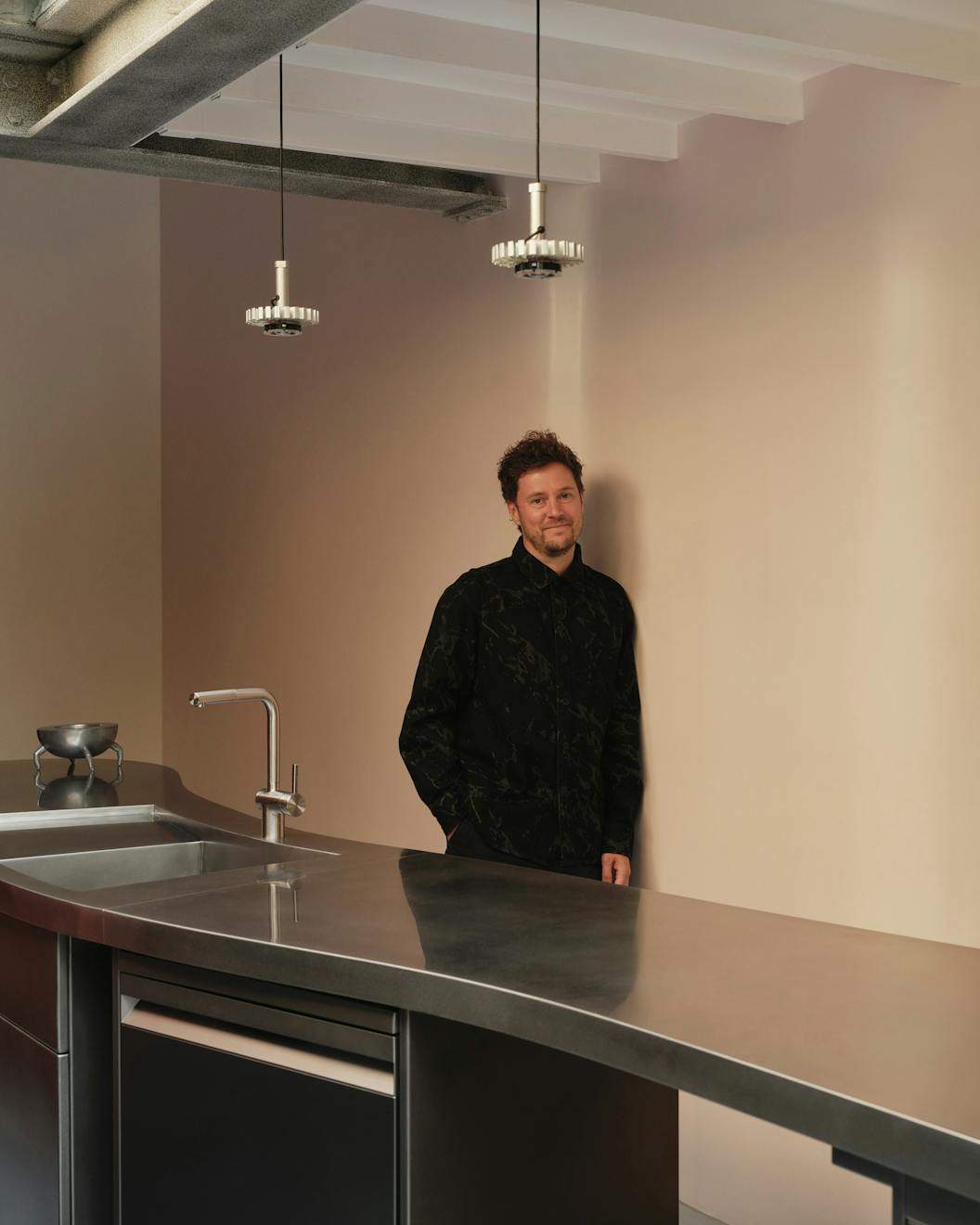
“Responding to the client is more interesting to us than repeating previous projects or attempting to replicate a style,” says Mat Barnes, founder of the anomalous architectural practice CAN. Though its style may be hard to pin down, the studio is known for its use of coruscating colour and unexpected details, crafting spaces that challenge assumptions around familiar typologies, such as the ubiquitous Victorian terrace kitchen extension, perfectly exemplified by its latest project: Druid’s Grove.
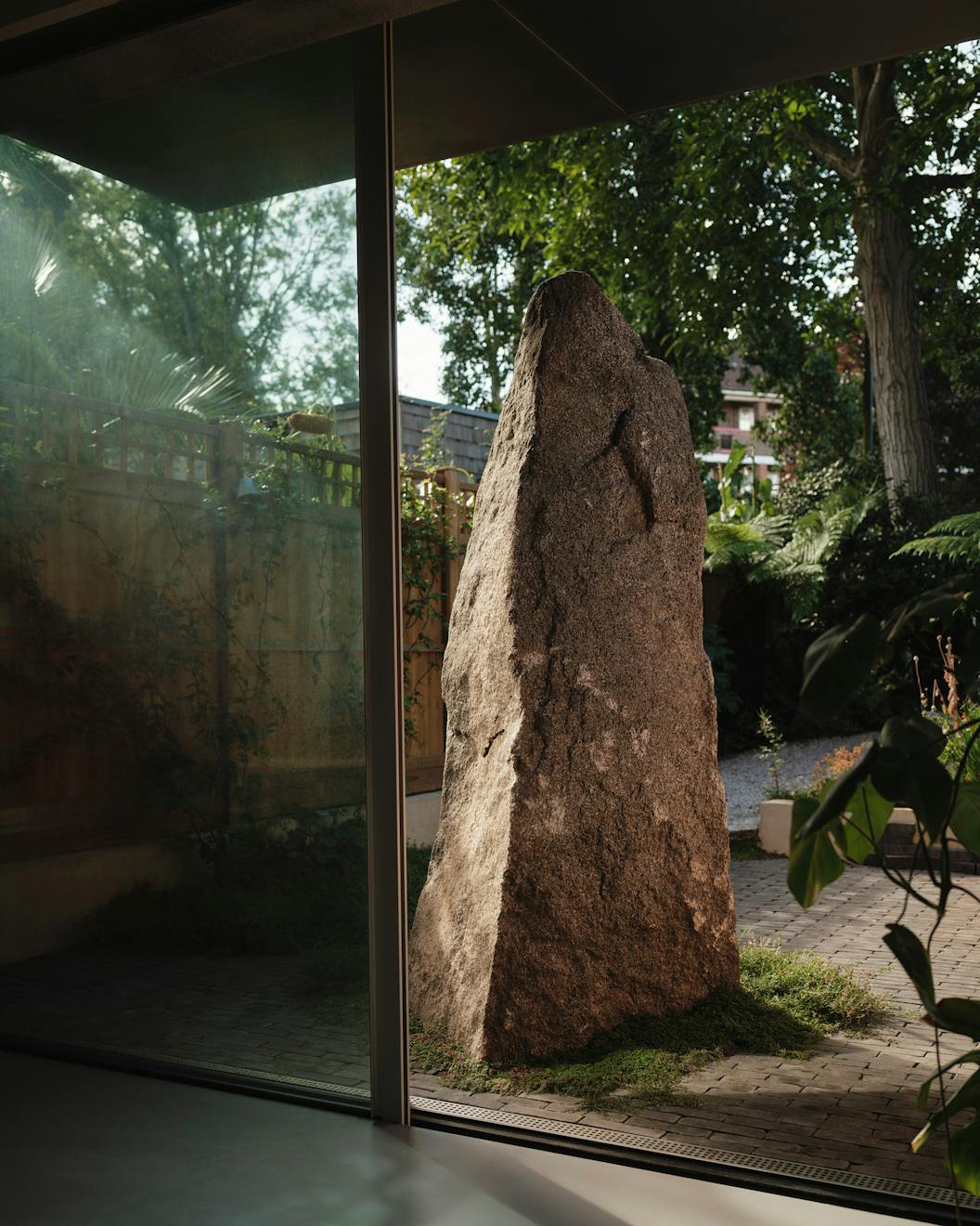
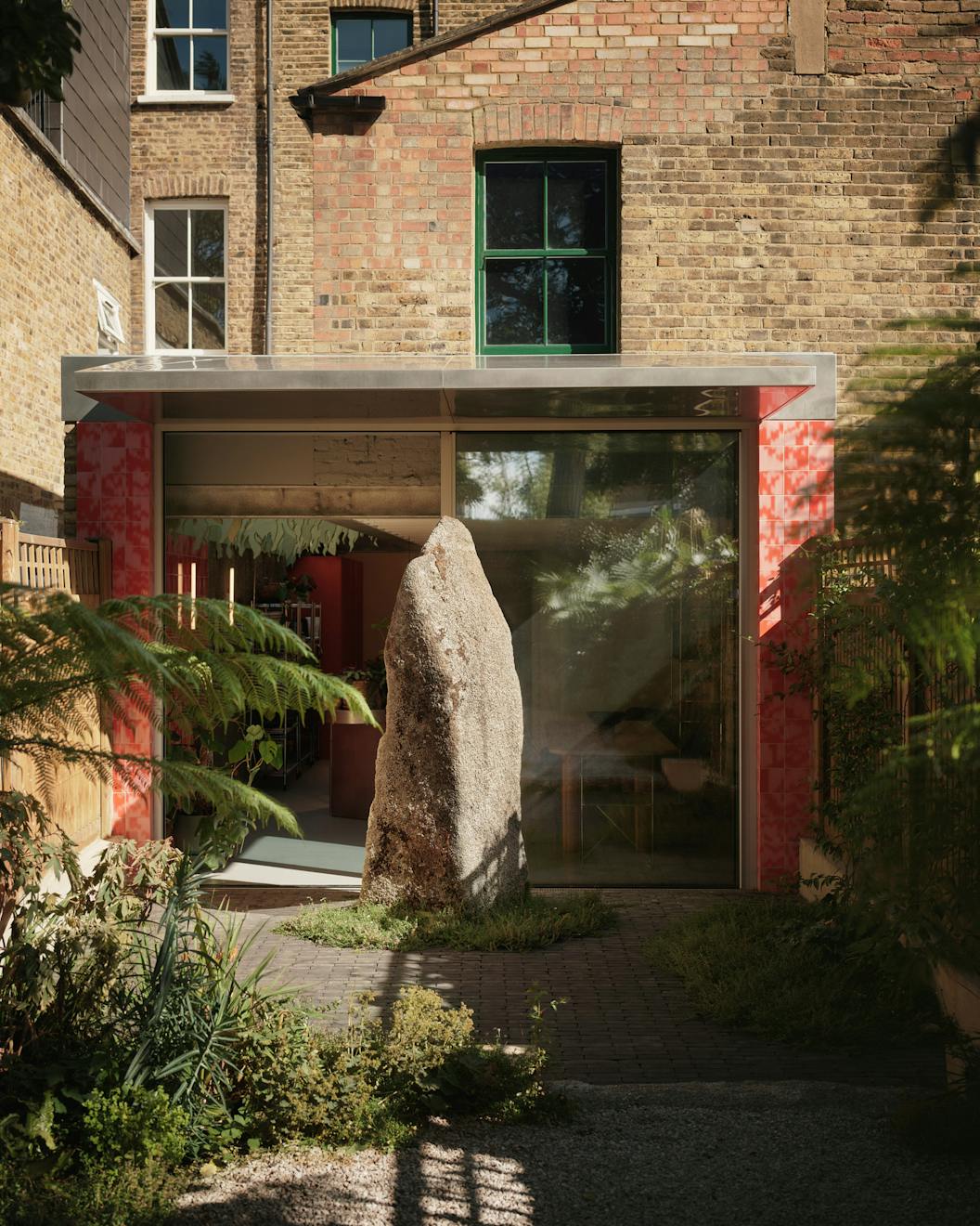
Take, for example, the monolithic standing stone, or ‘menhir’, set within the back garden, acting as a symbolic anchor while also screening the space from curious neighbours. Chosen by Mat and the client, the ancient rock was brought from Cornwall to north London and placed almost as a manifesto for the project; utterly unique and formed by an organic process over time.
We spoke to Mat about banning architectural references, crafting tendrils out of linseed stained Douglas fir and creating buildings with personality.
We ask for two parts of the brief. First, a spatial brief just outlining the spaces you need, spaces you’d like, and things you don’t like, kitchen islands, for example. Second, we ask for what we call an image bank. We’re really trying to understand the client’s tastes and interests, so they aren’t allowed to include any architecture.
We argue that if you look at a piece of architecture without knowing the design journey behind it, who the people are, how they got to that point, you can’t fully understand it. That’s why we aim to make our architecture as personal and specific to our clients as possible. To do that, we try to understand their tastes, which might include film sets, art, textures, colours, or materials they like.
We often get things like holiday photos. For one project, the client wanted a paint scheme inspired by the first Mini he bought as a teenager; an orange-and-white stripe design. Slightly unusual, but it tells us something about him.
We started thinking about it around five years ago. We use a lot of references in our work, but most of the ones we relied on weren’t architectural. When we looked at what clients were sending us, it was mostly hundreds of brick-side extensions with Crittall windows pinned from Pinterest. It didn’t really tell us anything we didn’t already know.
Most clients had searched for “side extension” and found images they thought looked good, but it didn’t reflect their personal taste, it just reflected what was fashionable at the time. But when we started removing architecture from the image bank, it gave us a much better understanding of the client’s actual likes and dislikes.
If we suggest painting a whole room bright blue without context, they might hesitate. But if we can show them a holiday photo from Marrakesh in 2002, where they were by a bright blue pool, and say, “We want to recreate that feeling,” they’re much more receptive.
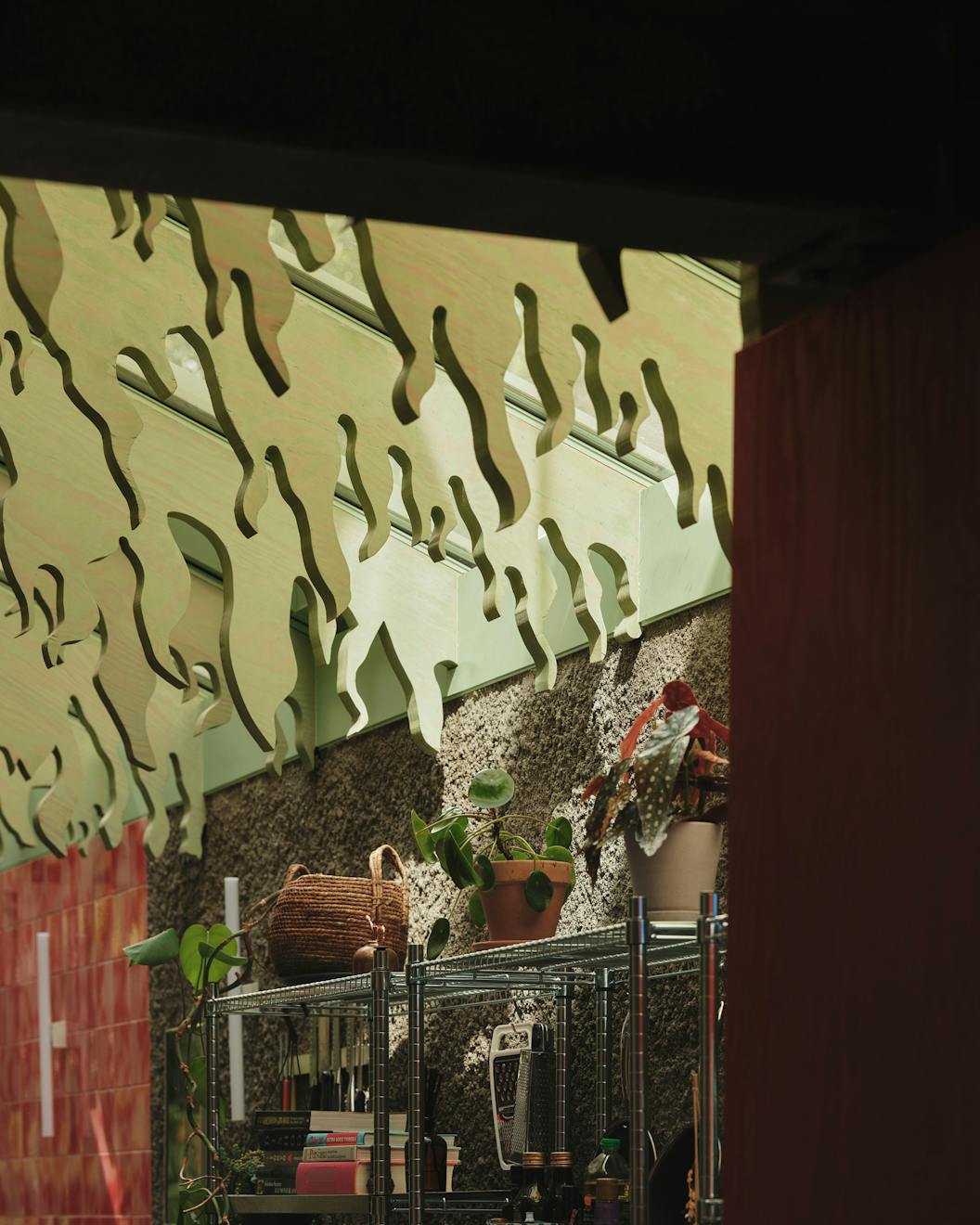
The client is an artist whose work is heavily inspired by video game worlds, lots of hyper-saturated, fantastical nature, think something like Avatar but without the blue people. Her image bank included images of concrete with plants growing out of it, as well as paintings featuring lush natural motifs.
The spatial brief was fairly simple. The existing house was poorly arranged, with a previous side extension that made the ground floor dark and blocked by a lot of structure.
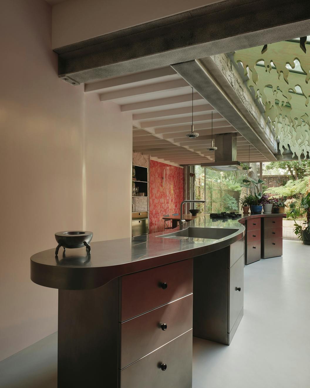
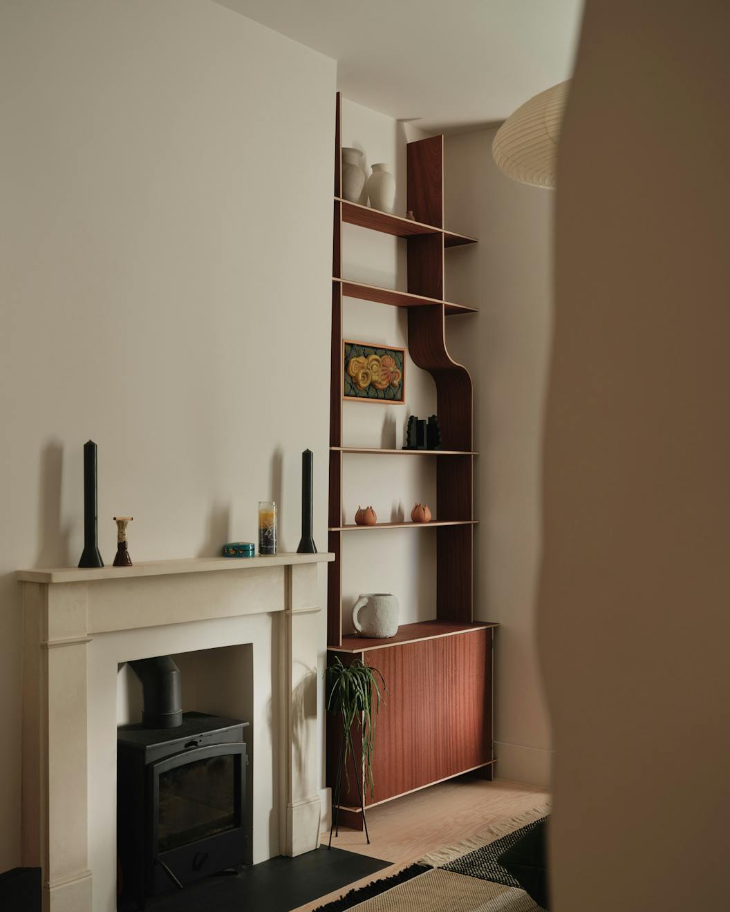
Our plan pushes the kitchen back to occupy half of the old dining area. Then the two cave openings are in this section, creating an antechamber-like space in the middle, where you can go left or right, spatially quite simple. We’ve also added a small extension at the back and reworked the roof of the existing side extension.
At this stage, clients often want to start discussing what the kitchen is made of or what the tiles will be like. We try to steer the focus back to the plan first; we want to decide on the layout before they get excited by the finishes, so nothing distracts from the bigger picture.

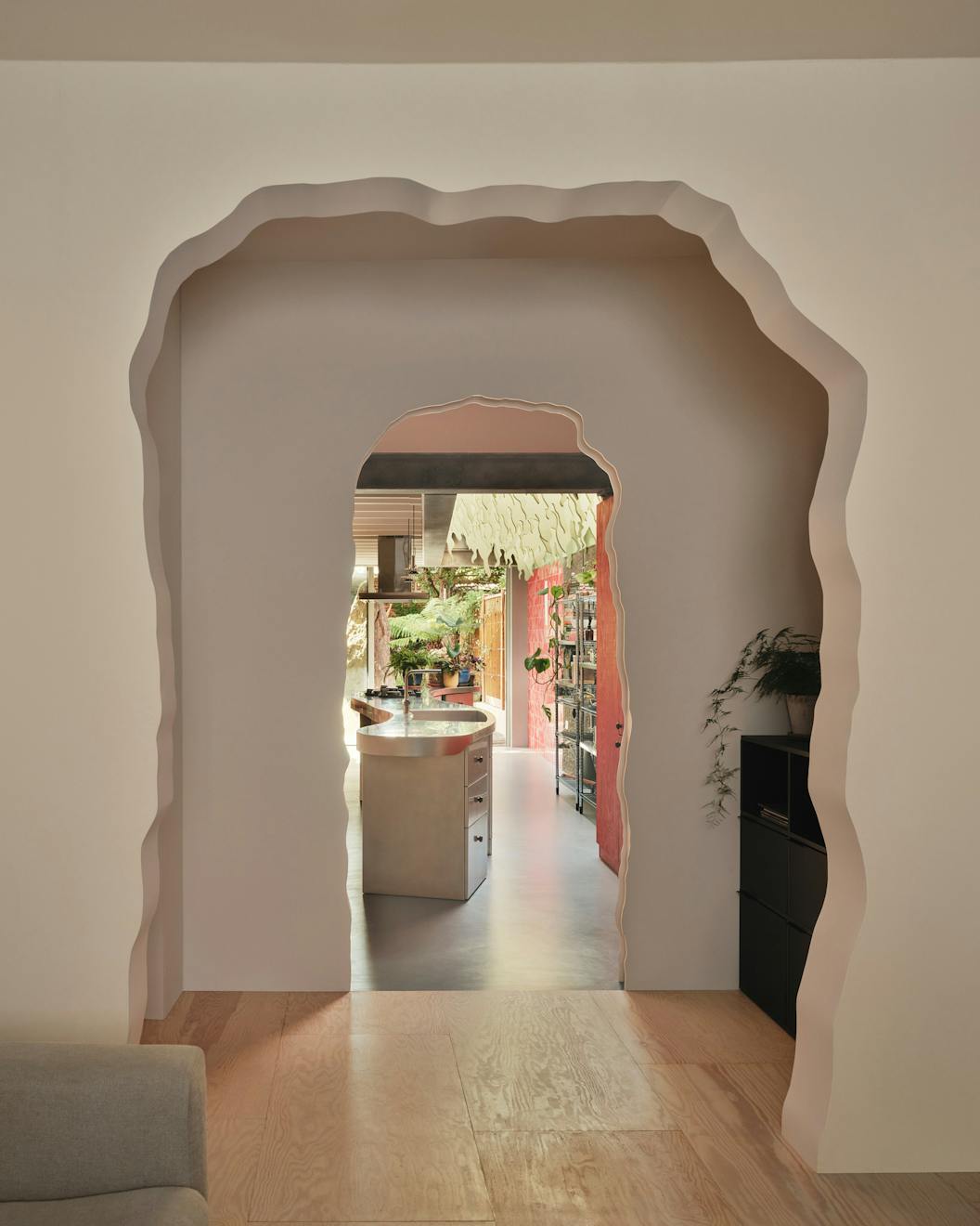
The rock was something we included in the proposal, but we didn’t bring it in until the planning stage. First, we decided on all the spatial qualities, and we actually had a few other options as well. The image bank mixed industrial forms with more organic ones, which is the approach we followed.
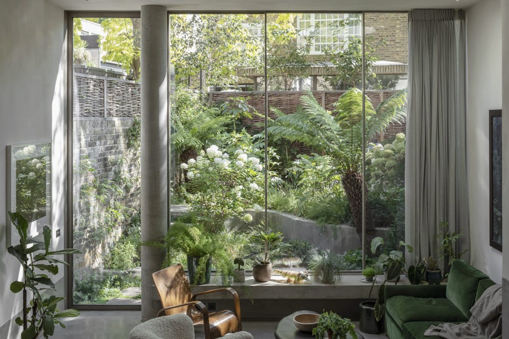
The client wanted large glass doors and for the space to feel as open to the garden as possible, while also being shielded from the neighboring block of flats. This solution felt like the perfect way to achieve that, without relying on complicated shutters or other interventions.
The rock was incredibly stressful. Nothing really went wrong but it’s just that I’m probably the type of person who thinks, “Oh, it’s going to be fine.” Sometimes things let you down, so we had to organize the whole crane operation ourselves. The road was closed, everything was in place, and the rock was coming. I’d managed the council application for the closure myself to save the client a few thousand pounds. It was our first time doing it, and we’d assumed the council would handle all the traffic management, like signage and diversions. The day before, I called to check, and they said no, you had to hire an independent company. I ended up frantically organizing a traffic management team. I nearly bought the signs myself, but the contractor helped sort it. It was hands-on, but we got there in the end.
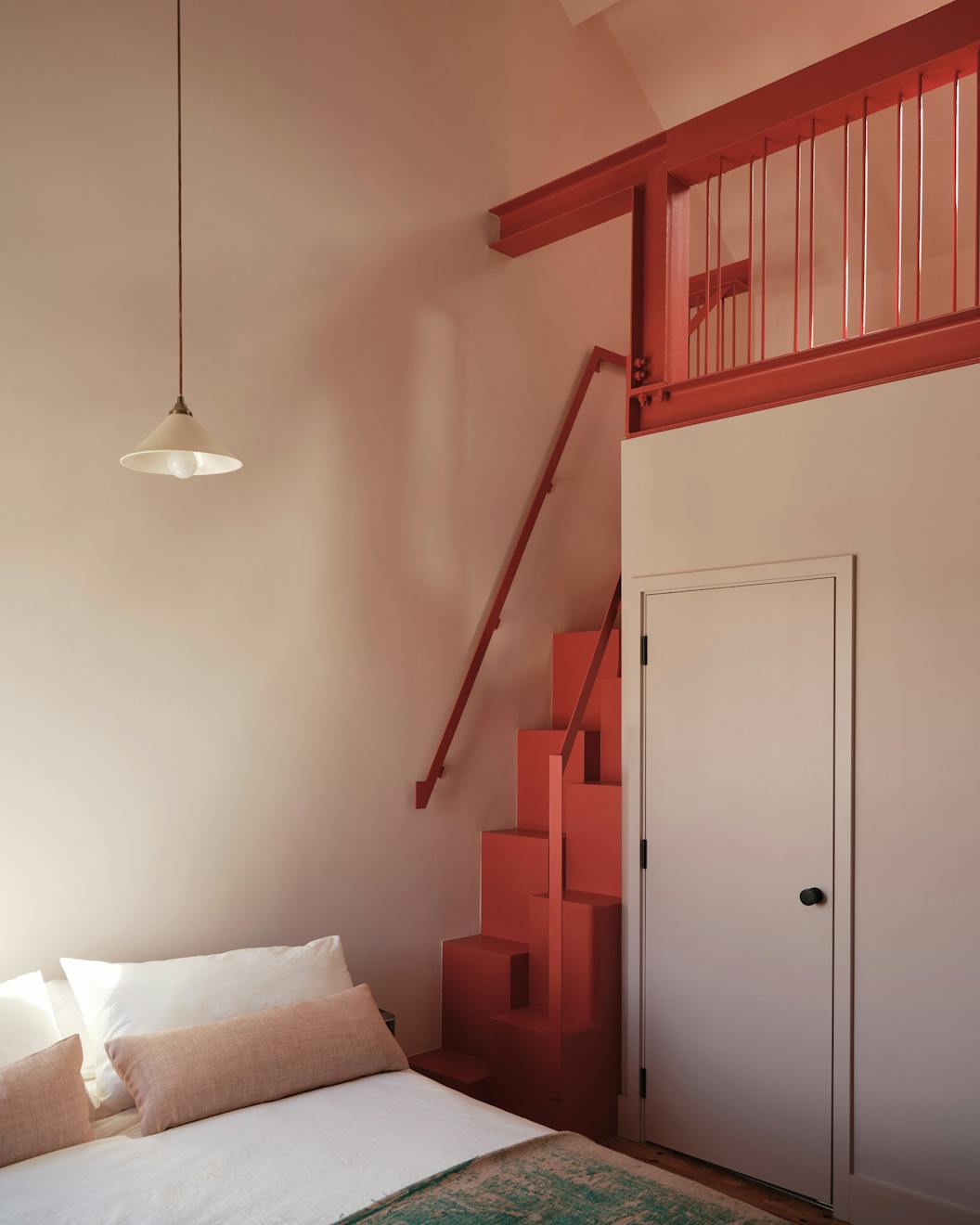
For elements like the cave openings and the tendrils on the trusses, the process was quite low-fi. We had an idea, showed it to the client, and then literally drew it together on site to get the right shapes. For the tendrils, the client helped draw a long line, which we then adapted in CAD. We printed the templates on paper, took them to site, and the contractor jigsawed them from Douglas fir. It’s a strange process, but it worked.
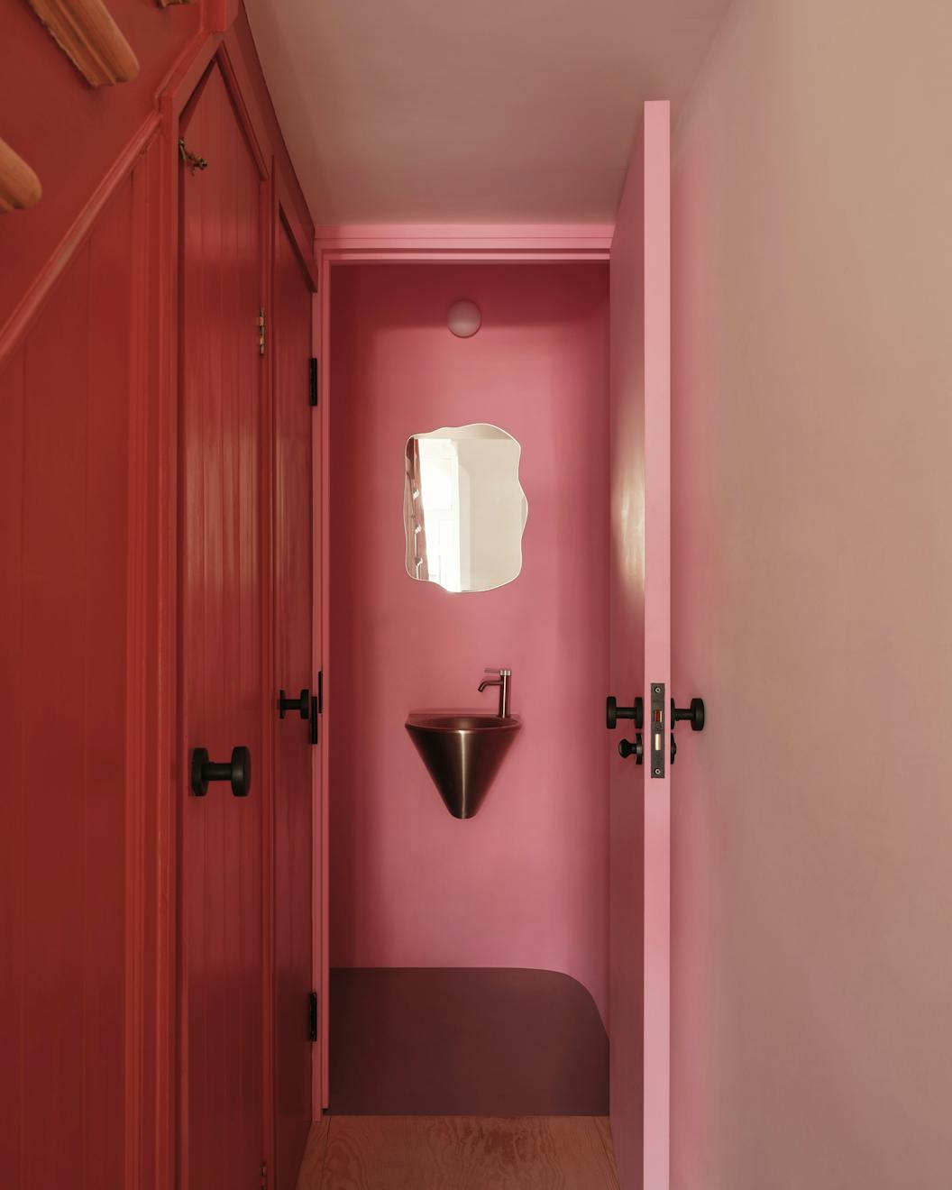
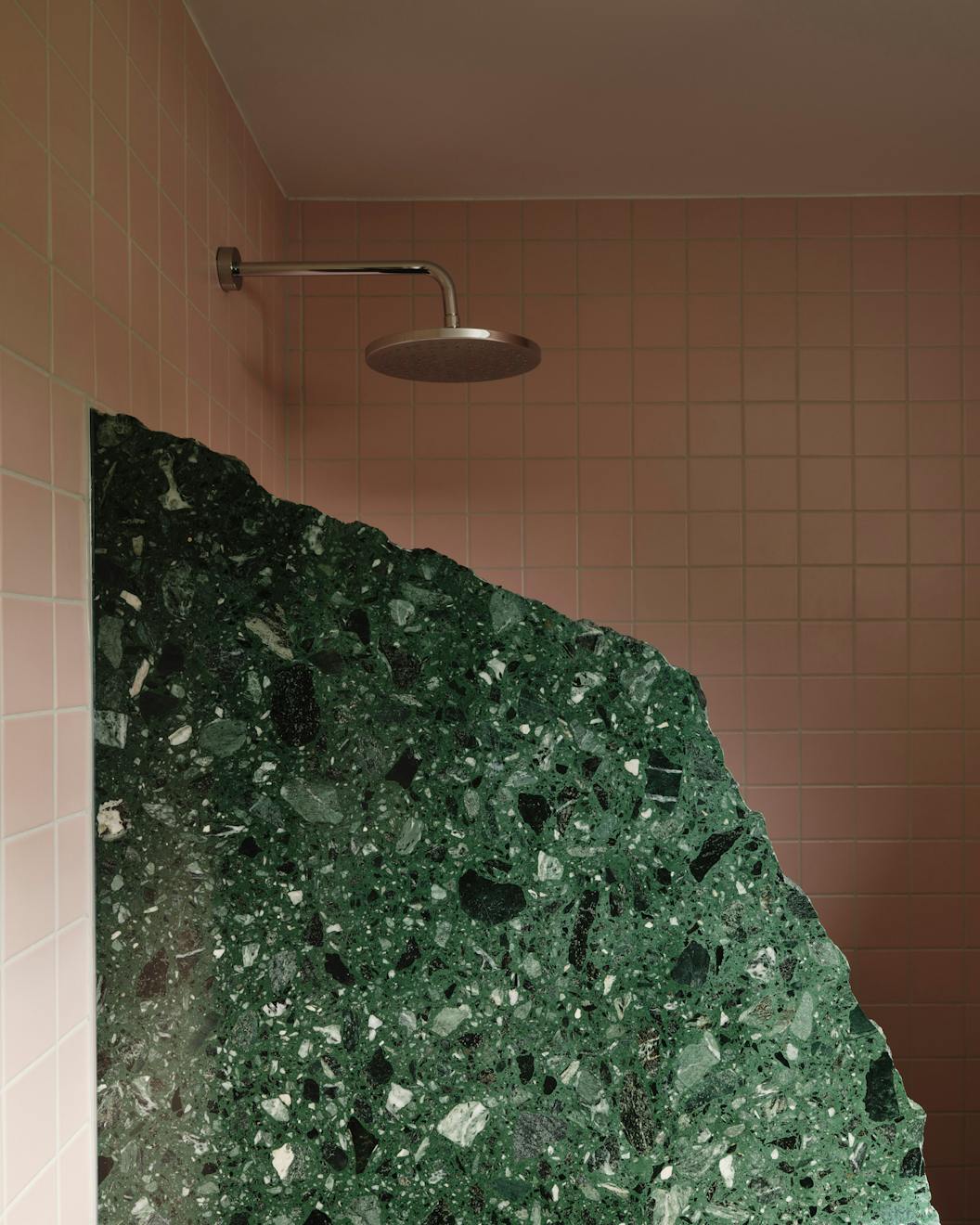
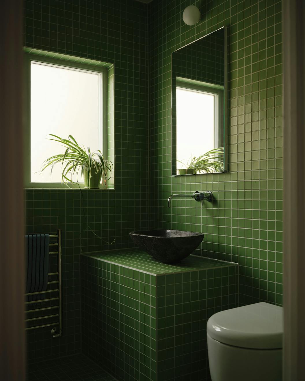
The bathrooms each have a single focal point, like a green wall with a rock sink in one, and in the client’s en-suite we used a terrazzo shower screen that we textured with the crumble effect. The process was really straightforward, the builder just sent me a picture, I drew on it to show how I wanted it broken, and they did the rest with a hammer.
I think it’s more about creating spaces that frame memories. I often think back to my own childhood. You don’t tend to remember the generic parts of a house, at least, I don’t. I grew up in a fairly standard semi-detached house, but there was a very small circular window in the hallway. I remember that window vividly.
Including slightly unusual or bold elements like that can anchor memories to a space. I also like to think that by incorporating very personal references into someone’s home, it becomes more meaningful to them. If you just choose blonde wood and polished concrete, sure, it may look nice, but it doesn’t feel personal. Adding something connected to the client in a subtle, abstract way makes them feel, “Yes, this is really my home.”
But it’s also about the layers, instead of architecture being a backdrop that you then add personal things to, like prints, pictures or art. Here, the building itself expresses those ideas and that sense of personality. It’s as if the architecture becomes the foreground.