Ahead of the curve: the fashion stylist with a flair for bold colours
Words by Hannah Nixon
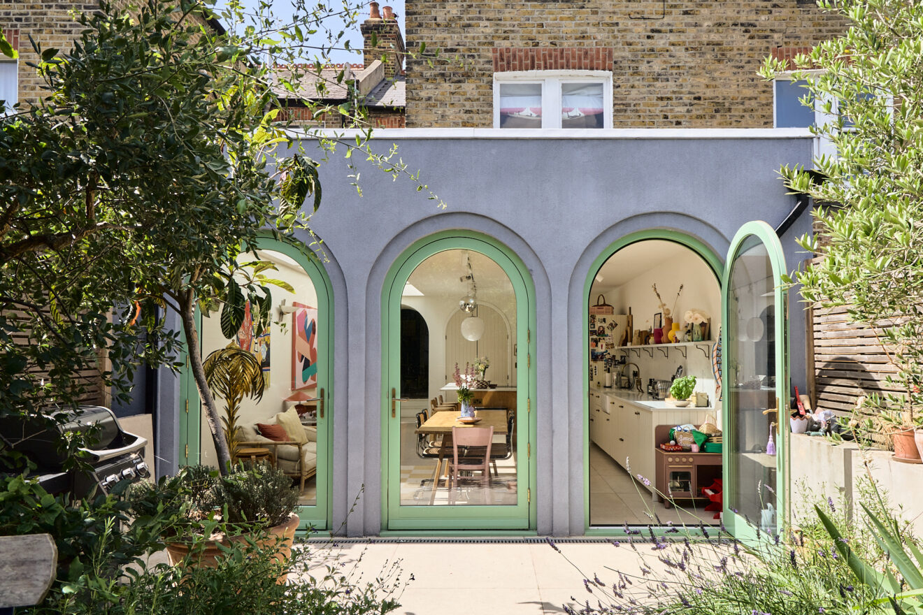
When Florrie Thompson and her husband Tarquin moved into their South London terrace, they knew a kitchen extension was on the horizon for their growing family. Wisely choosing to live in the house for a year before committing to any building work, Florrie used the time to compile a comprehensive moodboard. “I had so many references — one of the architects we didn’t end up working with was a bit put off,” she says, laughing.
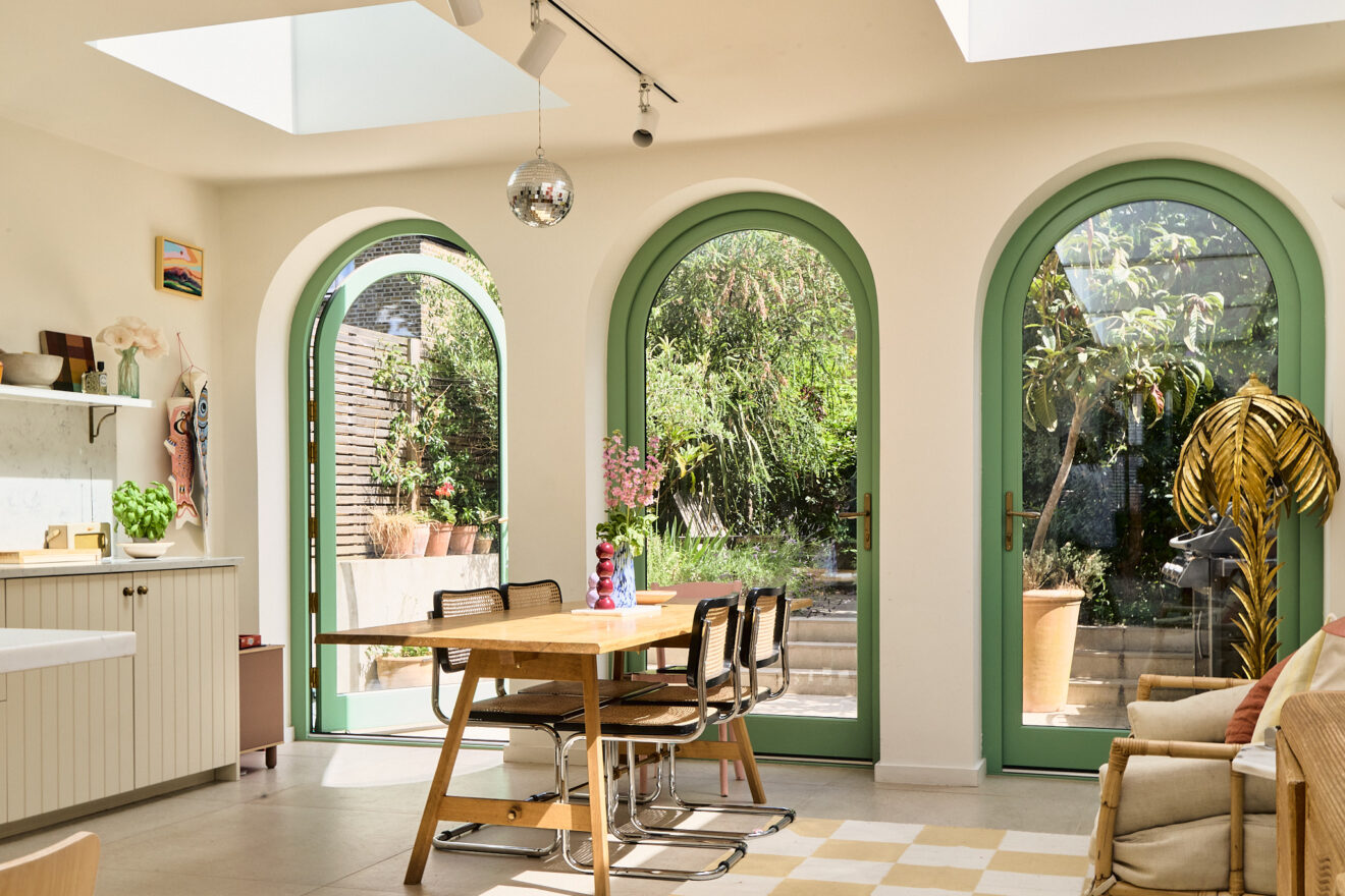
Facing the well-trodden dilemma of what to do with a side return, the couple clicked with architect Paul Turner, who quickly grasped what made them tick — “Tuscan villas, the heat of the summer, gallery-style walls” — and proposed a concept that captured the relaxed energy they loved, while also drawing inspiration from Raphael’s School of Athens. The sweeping Romanesque arches that now crown the rear of the sun-filled extension were originally destined to be black, but a last-minute change cast them in a gentle sage green instead.
It’s little surprise that Florrie has a confident approach to colour, given her background as a fashion editor for magazines including Harper’s Bazaar and Condé Nast Traveller. She talks to us about curves, colour and why the key to dopamine decorating is in bold decisions.
We wanted to buy a Victorian terrace, which is not particularly unique in London, but we really liked the space in terraces and we felt like it was a good size for having a family. We could move in and live here for a while and figure out what work we wanted to do. I think it’s easier than just doing a full reno when you haven’t experienced the light and the space. We waited for a year or so to kind of work out exactly what we wanted to do.
Yes and if you saw it, you would laugh because a lot of it was Italian villas in Tuscany and we’re in South London – let’s be real. But they were referencing the idea of arches and big, airy spaces. We wanted to add that in while creating a space that was simpatico with what we loved about a Victorian house. We love to be in the Mediterranean and we wanted to get a little taste of that feeling of padding around with bare feet on a stone floor.
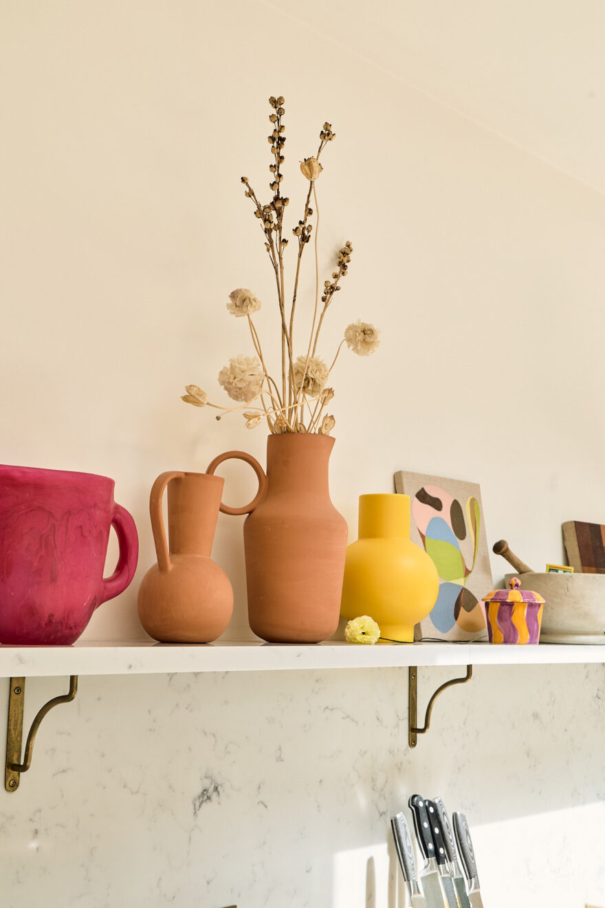
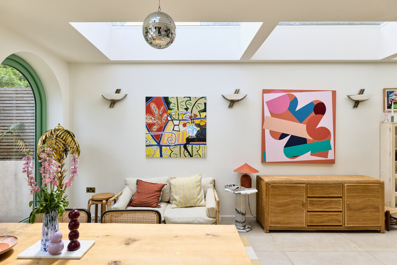
I’ve always felt quite strongly that I like having blank canvases and then adding colour. We’ve got colour drenched rooms, but I wanted the kitchen to be a blank canvas and then the intention was to add colourful art.
The idea was that you could change it, almost like a gallery space. That sounds a bit pretentious to talk about your kitchen like that, but I love how you can add interest with the things that you’ve collected.
We met a few, but Paul Turner had an amazing creativity. We were aligned in the way we thought about things. I loved that he listened to more practical things that we said. I was pregnant, so the idea was to create a space that was going to be partly a kitchen, dining room and unfortunately, a playroom.
He really understood that, but he was also very good at bringing the style to it. Essentially it was a big white room, but it had these really clever symmetrical arches in the doors and through the house.
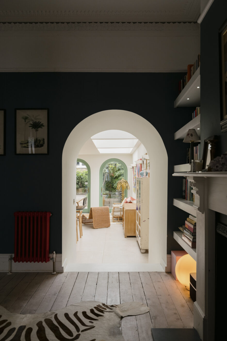
The arches came quite early on from my references. I got obsessed with them. There was something about them that I felt was a nice balance between, interesting and classic.
We were very anti-bifold. I know people love them, but for this, we just really wanted doors. The arched doors just gave it a bit of an extra something.
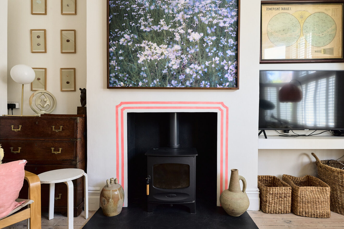
Being a fashion stylist, I’m quite scared by the permanence of interiors. Fashion, you can change every day. You can change it up during the day if you wish. At the beginning, we were thinking, we’ll go black. Black is classic. But Paul really encouraged us to choose a colour. I found an archive Farrow & Ball colour, and I could not be more pleased about being bold with that. I like classic things, but then I always want an unexpected twist.
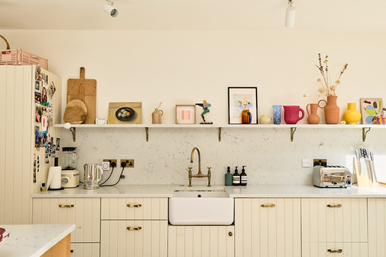
We were always trying to fit within budget, but we splurged in some areas. We got the beautiful, porcelain floor from Mandarin Stone, which we liked because of how big the tiles are. Most of us have a budget when you’re decorating and building work can be expensive. One thing I would recommend was spending on some areas and less on others. With the kitchen, getting Naked Doors to do the bespoke door fronts was a clever way of making it look exactly how we wanted, and then adding special little handles from Beata Heuman.
In terms of the objects in the room, it’s all a mix, but a lot of them are vintage. This glass drinks cupboard was an amazing find on Instagram, it was great because it’s meant to go on a wall, but it’s super narrow and so as a result it just doesn’t take up that much space in the room. I’m always slightly drawn to eighties things. I’ve got so many jugs and vases, but I just like all the pops of colour again.
The painting is from Interrupted Art. You subscribe and then every three months they send you a new piece of art, which really does feel like a gallery because we’ve had a few pieces and they all bring something different to the kitchen.
I’ve thought that it would be cool to paint something around there. It was always on my to-do list. And then one evening I decided to seize the day when the kids were asleep.
I would say the way I go about getting dressed is the same as interiors – it’s a balance. Our doors are a good example of that, as well as painting around the fireplace in a slightly mad fluoro pink. It just adds an unexpected twist to a neutral room.
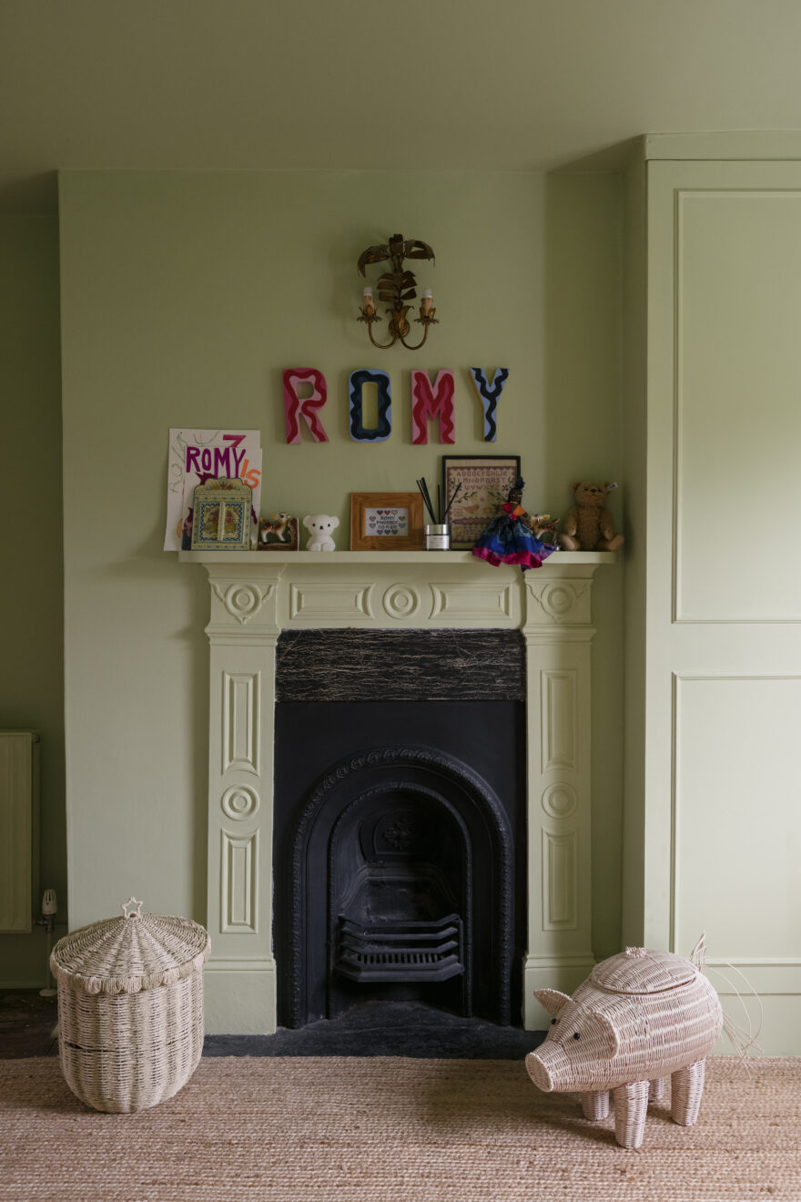
My four year old’s room is avocado green, which is quite Marmite. Some people don’t like it, but I find it very cosy. We painted the fireplace and ceilings in the same colour, which I really like doing.
I would say to anyone who’s playing it safe to just be a bit bold. You don’t have to be bold in every area. I really understand that feeling of ‘this is such a permanent choice’, but I would just say go for it, because it really can make you feel happy every day.